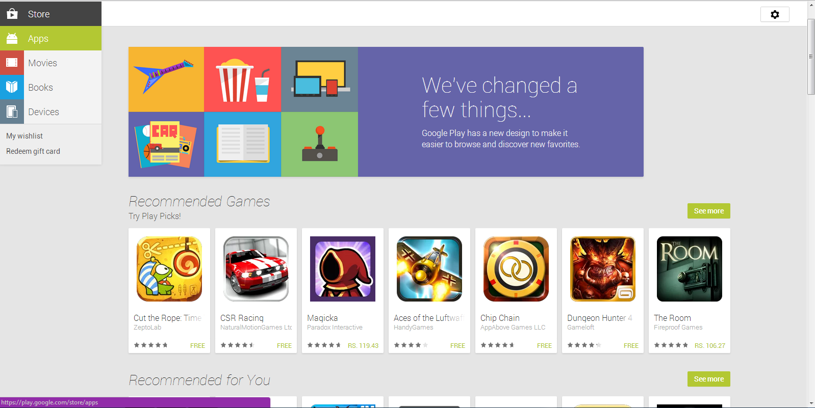
Google has revamped the web version of Android App on Play Store with a new look. Now it has got a card based look, making it more easier in spotting our Favorite Applications. You can find changes in the entire page of the website. The new look seems to be very attractive making our download much simpler. The pages will now load much faster than the old site.
New Version of Android App On Play Store
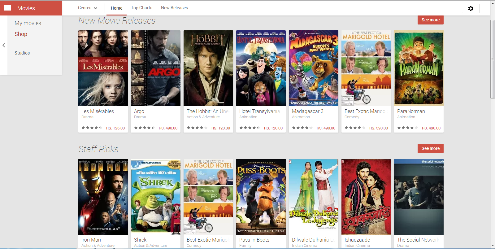
Though there are some changes in the web page users can still download or rent Movies, Books, Music & Magazines and even download the app on your android phones right from the website. The search feature will allow the users to search for the results across different categories. The flow from one page to another is very easy giving its users a different experience.
With the new design now you can easily navigate from one category to another. Categories like Apps, Movies, Books, etc. are placed at left hand side column along with the My wishlist and Redeem gift card. The homepage also features recommended lists, new releases, top lists and other listings of the respective categories.
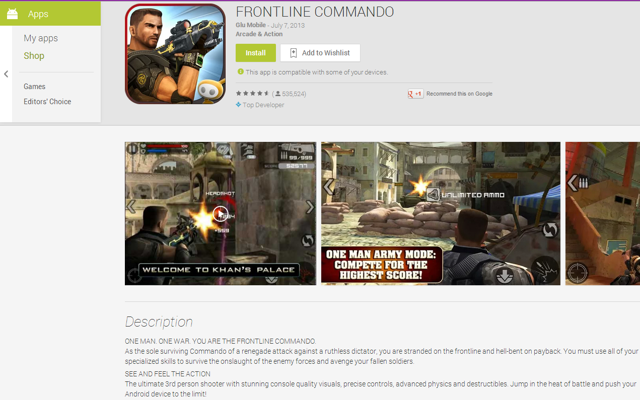
Columns and tabs have been completely vanished from the site which separates the reviews, what’s new, descriptions etc. The screen shots of the apps and games are now bigger. Now when you open any app of your choice you can find Add to Wishlist button is added next to the right of Install Button. This is followed by the Screen Shots, Descriptions, Reviews and Information. You will also find Similar Apps and More from developer options in the same page.
Overall the new design of the Play Store will offer its users a simple navigation with results loading much faster than ever and finally a great look from a user point of view.


